


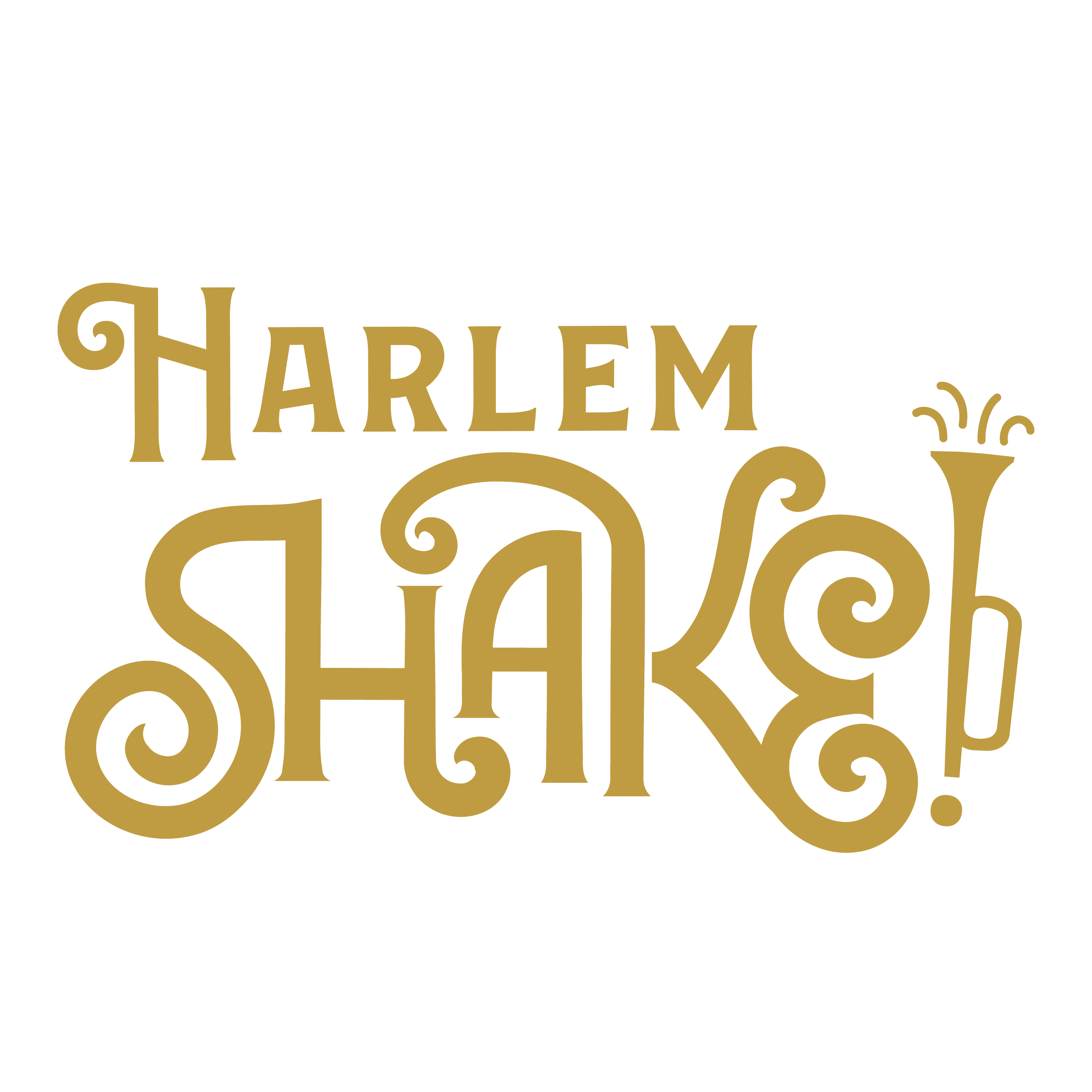
Harlem Shake
Instructor: Mia Culbertson, Tyler School of Art & Architecture
Year: Fall 2023
Branding Idenity, Packaging, UX/UI
“Harlem Shake” is a Philadelphia-based restaurant that celebrates African American culture through soul food, inspired by the Harlem Renaissance. Philadelphia's vibrant cultural mix makes it the perfect setting for this mission, which aims to revive Black pride and foster unity in a divided world. The design of Harlem Shake honors African American heritage while incorporating elements from the luxurious geometric elegance of the Art Deco era, creating an inviting atmosphere. The goal is to create a refined dining experience that remains accessible to all, exposing guests to diverse identities and expressions within the African American community.

My early education on African American culture deeply influenced this project. Growing up, I felt disconnected from my heritage due to a lack of representation in mainstream culture and education. Learning about the Harlem Renaissance transformed my perspective, revealing a rich cultural legacy that extended beyond slavery and highlighted creativity and resilience. Although the Harlem Renaissance significantly impacted American culture in the 1920s, its importance is often overlooked in later education. I aimed to create a luxury dining experience that feels welcoming to everyone.


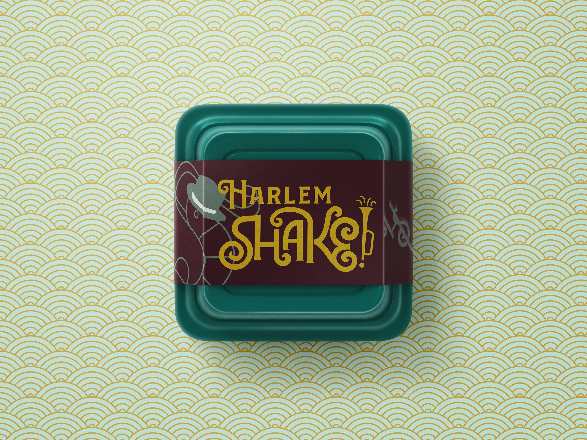


Although the Harlem Renaissance significantly impacted American culture in the 1920s, its importance is often overlooked in later education. I aimed to create a luxury dining experience that feels welcoming to everyone, blending the elegance of Art Deco with the spirit of the Harlem Renaissance. Seafood, particularly shrimp, plays a central role in our soul food offerings, while our color palette reflects the flavors of Southern cuisine. Accordingly, our brand graphics echo oceanic themes, drawing from traditional seafood ingredients. The language we use throughout our branding reflects Southern vernacular and culture, such as the pronunciation of “shrimp” as “shrimp.”


This project revitalized my pride not only in being African American and allowed me to share my cultural perspective while honoring historic art movements that still resonate today. I appreciated the opportunity to explore vector illustrations while recreating the Art Deco style. Utilizing geometric shapes to construct an illustration was fascinating, as it involved learning to simplify objects while retaining their familiarity. Additionally, experimenting with color was always exciting! I enjoyed trying out various color themes while still conveying a distinct tone or emotion.


Sketches & Drafts
In creating this brand, my objective was to develop a luxury dining experience that feels both welcoming and accessible to all. I aimed for guests to feel included and at home, regardless of their backgrounds. To accomplish this, I blended the elegance of Art Deco with the rich cultural influences of the Harlem Renaissance in both typography and graphics. I also designed imagery that embodies this fusion, featuring smooth, curved geometric shapes that reflect the timelessness of both styles. Given that traditional black soul food often includes seafood and a variety of fresh vegetables, I integrated seafood elements into the design, with shrimp serving as a prominent symbol due to its significance in Southern African American cuisine. The color palette draws inspiration from the flavors of Southern seafood, fostering a warm and inviting atmosphere.


